In color theory, understanding color relationships is crucial for effective design and art.
1. Monochromatic: Monochromatic color schemes use a single color with varying shades and tints to produce a consistent look and feel. Although they lack color contrast, they're often very clean and polished. You can also easily change the darkness and lightness of your colors. Check out all the monochromatic colors that fall under the red hue, a primary color.
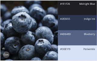
2. Analogous: Analogous color schemes are formed by pairing one main color with the two colors directly next to it on the color wheel. You can add two more colors (found next to the two outside colors) if you want to use a five-color scheme instead of just three. Analogous structures do not create themes with highly contrasting colors, so they're typically used to create a softer, less contrasting design. For example, you could use an analogous structure to create a color scheme with autumn or spring colors. This color scheme is excellent for warmer (red, oranges, and yellows) or cooler (purples, blues, and greens) color palettes like the one below.
3. Complementary: A complementary color scheme is based on two colors directly across from each other on the color wheel and the relevant tints of those colors. The complementary color scheme provides the most significant amount of color contrast. Because of this, you should be careful about using complementary colors in a scheme. It's best to predominantly use one color and the second color as the accent color in your design. High contrast helps you highlight important points and takeaways.


