Sunday, October 3, 2021

Watercolor Tutorial: Lemons


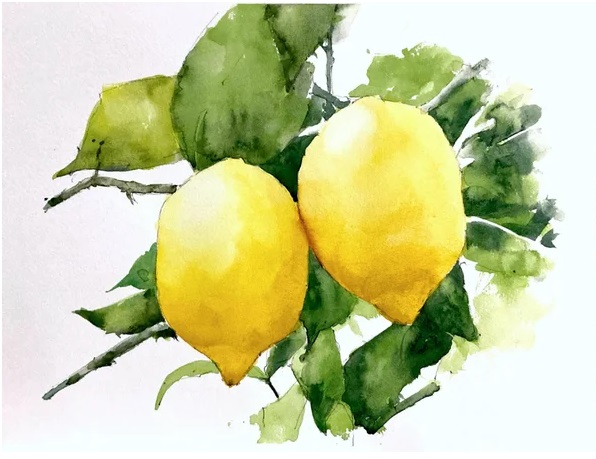
Lemon Watercolor Tutorial

Painting a lemon in watercolor might seem challenging, but you can do it with just a few colors and a little patience! Lemons have such a bright, cheerful yellow that they’re perfect for watercolor practice. Follow along with this demo, and you’ll see how a couple of tricks can make the process easier.


Step 1: Draw the Outline

Start by creating a pencil drawing of your lemon. If you’re not confident in your freehand skills, use a grid. Divide your reference photo and your watercolor paper into quarters. This will help you match the proportions without complicated calculations. Be mindful when using watercolor; pencil lines can show through since the paint is transparent. To avoid this, use light dots at the grid intersections, which won’t be noticeable under your paint.


Step 2: Make Test Swatches

Before diving into the painting, create some test swatches of your colors on a piece of scrap paper. Test your lemon yellows, leaf greens, and shadows. This step helps you get a feel for how your colors will look on the final painting, and it also gives you confidence when you start to paint.


Step 3: Start Painting Your Lemon

Begin by laying down your lightest yellow for the lemon’s main body. Start with a soft wash of lemon yellow, letting the paint flow naturally to capture the smooth roundness of the fruit. Once dry, you can go back in with a slightly darker yellow, like a touch of cadmium yellow, to add shading where the light doesn’t hit.


Step 4: Paint the Leaves

For the leaves, mix lemon yellow and cobalt blue with a tiny bit of black to create a rich, dark green. Apply this to your leaves, using the mix for the shadows to add depth. Remember to observe how the light hits both the fruit and the leaves so that your painting looks convincing.


Final Step: Touches and Details

Once your painting has dried, go back in for the final touches. Strengthen the shadows with another layer of color, and add tiny details like the lemon’s texture or veins in the leaves.


Watercolor is all about layering and patience—let each layer dry before adding the next! Most importantly, enjoy the process and be proud of your work. You’re learning and improving with each brushstroke. Happy painting!

Tuesday, September 28, 2021

Watercolor Tutorial: Fruits 01


Painting a still life in watercolor can be both challenging and rewarding. While objects remain stationary, you control the arrangement and lighting, making it a seemingly simple subject. However, achieving realism requires keen observation and attention to values and colors. In this tutorial, we'll guide you through a still life of fruit, layer by layer, to help you develop these essential skills.


Preparing for the Painting

Before diving into the painting, it's helpful to create value and color swatches. This step allows you to analyze your color choices and prepares you to work more efficiently once you start painting. Watercolor is a fast medium, and planning ahead ensures better results.


Start by sketching your still life setup carefully. Mark out the top, bottom, and sides to maintain correct proportions. Pay attention to the intersections of the fruits and their overall alignment. For soft-edged cast shadows, avoid using pencil lines that could show through the paint.


Layering: From Light to Dark

The first layer focuses on light values, covering the entire fruit, including shadow areas. At this stage, your painting may appear flat, but don't worry—this is a crucial part of building depth. Work from light to dark and soften the edges using a damp brush to create a smooth transition.


Once the first layer is dry, add mid-tones and shadows. Softening the transitions between light and shadow will help the fruit look round and three-dimensional. For tricky sections, like grapes, avoid painting each one individually. Instead, join shadow shapes together and use soft transitions for realism.


Adding Final Touches

As your painting progresses, deepen the shadows and add fine details like the stalks of the fruit. Pay close attention to cast shadows and adjust them as needed. At this point, the darkest values will bring your painting to life. Don't hesitate to compare your work to the reference photo to ensure accuracy.


By following these steps, you'll create a still life that captures depth, light, and texture. Trust the process, and with practice, you'll see your skills improve dramatically!


Monday, September 27, 2021

From Ghost Lines to Doodling Masterpieces


When teaching art, I often encourage students to use what I call "ghost lines." These are light, soft lines that allow for exploration and adjustment before fully committing to the final form. It helps ease the process of drawing and allows flexibility in shaping the subject. My approach emphasizes being economical with strokes, ensuring that each line carries meaning and intention. This method is a hallmark of the academic style of drawing, where precision and careful thought are prioritized.

However, I always remind students that this is just one way to approach art. There are many other styles and techniques, each with its own unique strengths. For instance, some artists use multiple lines and layers to gradually build up their final image. 

A great example of this is artist Cody James who creates intricate doodles with a ballpoint pen. Instead of aiming for perfect strokes from the outset, they allow the drawing to emerge through repeated lines and a more intuitive process. This shows that while a structured, economical approach can be effective, there is also beauty and value in more freeform, exploratory methods. Let me share a sample of this artist's work so you can see how different techniques can lead to captivating results. Click here.

Wednesday, July 14, 2021

Seeing in Shapes


 Remember all those shapes you learned as a child – circles, squares, triangles? They're making a comeback in your artistic journey!  This ability to see everyday objects as simplified shapes is a valuable asset for artists.


Imagine a house – it's essentially a cube with a triangular roof and a cylindrical chimney. Even a seemingly complex rose can be broken down into a basic circle or oval shape. A sprawling garden might start with visualizing it as a collection of many ovals.


But shapes don't have to be boring! To add visual intrigue, experiment with varying the sides and edges. A perfect square or triangle might be a bit predictable in a painting. Instead, aim to create more dynamic shapes by altering their sides and edges. Remember, variety is key in art, just like it is in life.


Finally, don't forget the power of implied shapes. Though not a perfect triangle, its overall form suggests one. This creates a more visually interesting element because the "triangle" isn't perfectly symmetrical – its sides are different lengths.


By honing your ability to see the world in shapes, you'll be well on your way to creating balanced and visually appealing artwork.

Tuesday, July 14, 2020

Size Matters


 In the world of art, size isn't just about big versus small – it's about intention and impact.  Just like lines and shapes, size can be used strategically within a piece.


One way to guide the viewer's eye is through size. By making an element larger and more dominant, you declare its importance.  Think of a painting with one flower significantly bigger than the rest. The larger flower becomes the star, attracting attention and creating more visual interest compared to a scene with flowers all the same size.


Artist Georgia O'Keeffe famously used size to compel viewers to truly see a flower. By presenting a normally small object in a massive scale, she created paintings with a powerful impact.  On the other hand, small paintings can create a sense of intimacy, drawing the viewer in for a closer look.


Variety in size is key to avoid monotony. Imagine a field of flowers where all the blooms are identical – it might resemble wallpaper, visually pleasing but lacking in artistic excitement.


Size can also be used to surprise and direct attention. A Western painting with a lone cowboy riding through a dreary rain shower. The entire scene is painted in muted grays, emphasizing the cold and wet atmosphere. But the cowboy's bright yellow slicker stands out, grabbing the viewer's eye not because of its size within the painting, but because it's a small burst of color in a vast area of gray.


Finally, size plays a crucial role in creating aerial perspective, the illusion of depth in a two-dimensional artwork.  Larger objects appear closer to the viewer, while smaller ones seem to recede into the distance.  By strategically using size, you can create a sense of space and depth in your artwork.

Sunday, July 14, 2019

Looking to Lines


While nature might not be overflowing with perfect lines, artists use them strategically to define shapes and create details.  Think about it – edges in the real world are rarely crisp lines. Often, it's a subtle change in color or value.


But in art, lines become a valuable tool. They help us define areas, create details like strands of hair or veins on a leaf, and contain shapes within the artwork. Lines can be explicit, like an outline that tells us where to paint, or they can be implied.


For example, imagine a row of geese flying across the sky. There's no actual line connecting them, but the viewer's eye will perceive them as a line because of their positioning. Here, the geese become an implied line.


Three main types of lines:


Curved lines: These are the soft edges you see in arcs, circles, and natural shapes like clouds, figures, and most organic forms.

Straight lines: Horizontal lines evoke a sense of calmness, while vertical lines create a feeling of upward movement. Using both in balance can add visual interest.

Angular lines: Diagonals and zigzags create a sense of tension, excitement, or action in your artwork.


Remember, variety is key! Just like uneven shapes are often more engaging than perfect ones, using a variety of lines can add dynamism and intrigue to your art.

Saturday, July 14, 2018

Adding texture


Texture refers to the surface quality, the way something feels to the touch. In art, we can create the illusion of texture, or even incorporate real textures, to add depth and interest to our creations.

There are two main approaches to texture in art:

Real Texture: This involves adding physical elements to your artwork. Think about sewing beads onto a canvas, gluing on small objects, or using other creative techniques.  You can also use paint additives to create thicker paint that can be applied in a way that creates a tactile sensation.

Implied Texture: This refers to creating the illusion of texture using painting techniques. For example, by using rough brushstrokes and adding small, detailed lines, you can make tree bark appear textured even though it's perfectly smooth on the paper. This "faux" (French for "fake") texture tricks the eye into believing there's a physical difference in the surface.

Experiment with different textures and invent your own unique styles.

Remember, moderation is key. While texture can add a lot, too much of it can create visual chaos.  But hey, if you subscribe to Mae West's philosophy of "too much of a good thing is marvelous!", then go for it! Just be mindful of the overall balance in your artwork.