Tuesday, September 27, 2022

The Meaning of Color


The meaning of color extends beyond mere aesthetics, influencing our emotions, perceptions, and behaviors. Each hue conveys unique symbolism, from warmth and energy to calmness and sadness, shaping our experiences and interactions in profound and often subconscious ways.

  • Red — is typically associated with power, passion, or energy and can help encourage action on your site.
  • Orange — joy and enthusiasm, making it a good choice for positive messaging.
  • Yellow — happiness and intellect, but be wary of overuse.
  • Green—often connected to growth or ambition, green can help create the sense that your brand is on the rise.
  • Blue — tranquility and confidence, depending on the shade — lighter shades provide a sense of peace, and darker colors are more confident.
  • Purple — luxury or creativity, mainly when used deliberately and sparingly on your site.
  • Black — power and mystery, and using this color can help create necessary negative space.
  • White — safety and innocence, making it a great choice to help streamline your site.


Cultures experience color differently.

Cultural contexts significantly shape color perception and symbolism, as various societies attribute distinct meanings to colors. While red typically symbolizes passion or power in the United States, it's considered a color of mourning in South Africa. Sometimes, entire color schemes are more or less palatable depending on the country and culture. Sukrahj, a graphic designer, is working on a logo for an India-based company that wants to use bright magenta and navy. That combination of colors "doesn't necessarily land in the U.S.," she says, "the same way it would in India." Understanding these differences enriches our appreciation of color's impact on communication and emotional expression across cultures.

Color Theory: Hue - Tint, Shade and Tone


Hue, tint, shade, and tone are essential concepts in color theory, shaping how colors interact and influence visual perception.

Hue refers to the pure color of an object, determined by its wavelength in the visible light spectrum. It is the characteristic that distinguishes one color from another, such as red, blue, or green. Hues are often represented on the color wheel, which organizes colors based on their relationships and positions.


Tint is created by adding white to a hue, lightening it and producing softer variations. For example, adding white to red creates pink. Tints are often used in design to convey gentleness or warmth, evoking feelings of calmness or sweetness.

Shade is produced by adding black to a hue, darkening it and resulting in deeper variations. For instance, adding black to blue creates navy. Shades can add drama and depth to a color palette, enhancing contrast and emphasizing certain elements in a composition.

Tone is achieved by adding gray (a mixture of black and white) to a hue, which alters its intensity without significantly changing its basic color. This process results in a more muted or subdued version of the original hue. For instance, adding gray to red can create a sophisticated or complex tone, suitable for various artistic contexts.


Understanding these concepts helps artists, designers, and anyone working with color create visually appealing compositions and effectively convey emotions and messages through their work.


Saturday, September 24, 2022

Color Theory: Traditional Color Theory


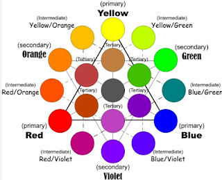
Traditional color theory forms the foundation of color relationships, focusing on primary, secondary, and tertiary colors. 

Primary colors—red, yellow, and blue—cannot be created by mixing other colors, making them the fundamental building blocks in design. These colors act as “parent” colors, offering a base for creating a variety of shades, tones, and tints. While primary colors are essential, designers are not limited to using only them. For instance, mixing primary colors can produce secondary colors like orange, purple, and green. 


These secondary colors are made by combining two primary colors, following the basic rules: 

Red + Yellow = Orange

Blue + Red = Purple

Yellow + Blue = Green

The combinations depend on using the purest forms, known as hues.

Tertiary colors come from mixing a primary color with a neighboring secondary color on the color wheel, resulting in colors like red-orange (vermillion) or blue-green (teal). 

It’s essential to remember that not every primary-secondary combination works harmoniously; for example, mixing red and green yields a brownish color instead of a distinct tertiary color. Tertiary colors expand the palette beyond primary and secondary shades, adding complexity to design.

Red + Purple = Red-Purple (magenta)

Red + Orange = Red-Orange (vermillion)

Blue + Purple = Blue-Purple (violet)

Blue + Green = Blue-Green (teal)

Yellow + Orange = Yellow-Orange (amber)

Yellow + Green = Yellow-Green (chartreuse)


The color wheel, a circular diagram, helps visualize the relationships between these 12 main colors—primary, secondary, and tertiary—while also including hues, tints, tones, and shades.

 The concept of the color wheel dates back to Isaac Newton’s work in 1704. Newton’s lab-based study of pigments contrasts with Johann Wolfgang von Goethe’s focus on perception and experience, highlighting early debates about primary colors. The traditional color wheel remains a valuable tool for choosing color schemes, illustrating how colors relate and combine based on the spectrum of visible light.