Thursday, October 27, 2022

Color Scheme - Part 1: Monochromatic, Analogous, & Complementary


In color theory, understanding color relationships is crucial for effective design and art.

1. Monochromatic: Monochromatic color schemes use a single color with varying shades and tints to produce a consistent look and feel. Although they lack color contrast, they're often very clean and polished. You can also easily change the darkness and lightness of your colors. Check out all the monochromatic colors that fall under the red hue, a primary color.


2. Analogous: Analogous color schemes are formed by pairing one main color with the two colors directly next to it on the color wheel. You can add two more colors (found next to the two outside colors) if you want to use a five-color scheme instead of just three. Analogous structures do not create themes with highly contrasting colors, so they're typically used to create a softer, less contrasting design. For example, you could use an analogous structure to create a color scheme with autumn or spring colors. This color scheme is excellent for warmer (red, oranges, and yellows) or cooler (purples, blues, and greens) color palettes like the one below.


3. Complementary: A complementary color scheme is based on two colors directly across from each other on the color wheel and the relevant tints of those colors. The complementary color scheme provides the most significant amount of color contrast. Because of this, you should be careful about using complementary colors in a scheme. It's best to predominantly use one color and the second color as the accent color in your design. High contrast helps you highlight important points and takeaways.


Tuesday, September 27, 2022

The Meaning of Color


The meaning of color extends beyond mere aesthetics, influencing our emotions, perceptions, and behaviors. Each hue conveys unique symbolism, from warmth and energy to calmness and sadness, shaping our experiences and interactions in profound and often subconscious ways.

  • Red — is typically associated with power, passion, or energy and can help encourage action on your site.
  • Orange — joy and enthusiasm, making it a good choice for positive messaging.
  • Yellow — happiness and intellect, but be wary of overuse.
  • Green—often connected to growth or ambition, green can help create the sense that your brand is on the rise.
  • Blue — tranquility and confidence, depending on the shade — lighter shades provide a sense of peace, and darker colors are more confident.
  • Purple — luxury or creativity, mainly when used deliberately and sparingly on your site.
  • Black — power and mystery, and using this color can help create necessary negative space.
  • White — safety and innocence, making it a great choice to help streamline your site.


Cultures experience color differently.

Cultural contexts significantly shape color perception and symbolism, as various societies attribute distinct meanings to colors. While red typically symbolizes passion or power in the United States, it's considered a color of mourning in South Africa. Sometimes, entire color schemes are more or less palatable depending on the country and culture. Sukrahj, a graphic designer, is working on a logo for an India-based company that wants to use bright magenta and navy. That combination of colors "doesn't necessarily land in the U.S.," she says, "the same way it would in India." Understanding these differences enriches our appreciation of color's impact on communication and emotional expression across cultures.

Color Theory: Hue - Tint, Shade and Tone


Hue, tint, shade, and tone are essential concepts in color theory, shaping how colors interact and influence visual perception.

Hue refers to the pure color of an object, determined by its wavelength in the visible light spectrum. It is the characteristic that distinguishes one color from another, such as red, blue, or green. Hues are often represented on the color wheel, which organizes colors based on their relationships and positions.


Tint is created by adding white to a hue, lightening it and producing softer variations. For example, adding white to red creates pink. Tints are often used in design to convey gentleness or warmth, evoking feelings of calmness or sweetness.

Shade is produced by adding black to a hue, darkening it and resulting in deeper variations. For instance, adding black to blue creates navy. Shades can add drama and depth to a color palette, enhancing contrast and emphasizing certain elements in a composition.

Tone is achieved by adding gray (a mixture of black and white) to a hue, which alters its intensity without significantly changing its basic color. This process results in a more muted or subdued version of the original hue. For instance, adding gray to red can create a sophisticated or complex tone, suitable for various artistic contexts.


Understanding these concepts helps artists, designers, and anyone working with color create visually appealing compositions and effectively convey emotions and messages through their work.


Saturday, September 24, 2022

Color Theory: Traditional Color Theory


Traditional color theory forms the foundation of color relationships, focusing on primary, secondary, and tertiary colors. 

Primary colors—red, yellow, and blue—cannot be created by mixing other colors, making them the fundamental building blocks in design. These colors act as “parent” colors, offering a base for creating a variety of shades, tones, and tints. While primary colors are essential, designers are not limited to using only them. For instance, mixing primary colors can produce secondary colors like orange, purple, and green. 


These secondary colors are made by combining two primary colors, following the basic rules: 

Red + Yellow = Orange

Blue + Red = Purple

Yellow + Blue = Green

The combinations depend on using the purest forms, known as hues.

Tertiary colors come from mixing a primary color with a neighboring secondary color on the color wheel, resulting in colors like red-orange (vermillion) or blue-green (teal). 

It’s essential to remember that not every primary-secondary combination works harmoniously; for example, mixing red and green yields a brownish color instead of a distinct tertiary color. Tertiary colors expand the palette beyond primary and secondary shades, adding complexity to design.

Red + Purple = Red-Purple (magenta)

Red + Orange = Red-Orange (vermillion)

Blue + Purple = Blue-Purple (violet)

Blue + Green = Blue-Green (teal)

Yellow + Orange = Yellow-Orange (amber)

Yellow + Green = Yellow-Green (chartreuse)


The color wheel, a circular diagram, helps visualize the relationships between these 12 main colors—primary, secondary, and tertiary—while also including hues, tints, tones, and shades.

 The concept of the color wheel dates back to Isaac Newton’s work in 1704. Newton’s lab-based study of pigments contrasts with Johann Wolfgang von Goethe’s focus on perception and experience, highlighting early debates about primary colors. The traditional color wheel remains a valuable tool for choosing color schemes, illustrating how colors relate and combine based on the spectrum of visible light.

Thursday, July 14, 2022

The Elements of Art


Have you ever wondered what makes a painting visually interesting? The answer lies in the elements of design, the fundamental building blocks that artists use to create any artwork. They're like the alphabet of art – once you understand them, you can use them to create anything you imagine, regardless of the medium.

Shape: This encompasses both geometric shapes (circles, squares, triangles) and organic forms (free-flowing shapes like blobs and curves).

Line: A simple definition – a continuous path connecting two points.

Size: The relative magnitude of an element – is it large, small, or somewhere in between?

Direction: The overall positioning of objects within your artwork – vertical, horizontal, or diagonal.

Texture: The way something feels, or the illusion of how it would feel if you could touch it.

Color: What brings vibrancy and life to your artwork. It can be used to create emotions, establish a mood, and guide the viewer's eye around the composition. From bold contrasts to subtle harmonies, color choices play a significant role in shaping the overall impact of your art.

By understanding and manipulating these elements, you gain the power to create captivating art. 

Sunday, October 3, 2021

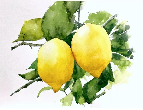
Watercolor Tutorial: Lemons


Lemon Watercolor Tutorial

Painting a lemon in watercolor might seem challenging, but you can do it with just a few colors and a little patience! Lemons have such a bright, cheerful yellow that they’re perfect for watercolor practice. Follow along with this demo, and you’ll see how a couple of tricks can make the process easier.


Step 1: Draw the Outline

Start by creating a pencil drawing of your lemon. If you’re not confident in your freehand skills, use a grid. Divide your reference photo and your watercolor paper into quarters. This will help you match the proportions without complicated calculations. Be mindful when using watercolor; pencil lines can show through since the paint is transparent. To avoid this, use light dots at the grid intersections, which won’t be noticeable under your paint.


Step 2: Make Test Swatches

Before diving into the painting, create some test swatches of your colors on a piece of scrap paper. Test your lemon yellows, leaf greens, and shadows. This step helps you get a feel for how your colors will look on the final painting, and it also gives you confidence when you start to paint.


Step 3: Start Painting Your Lemon

Begin by laying down your lightest yellow for the lemon’s main body. Start with a soft wash of lemon yellow, letting the paint flow naturally to capture the smooth roundness of the fruit. Once dry, you can go back in with a slightly darker yellow, like a touch of cadmium yellow, to add shading where the light doesn’t hit.


Step 4: Paint the Leaves

For the leaves, mix lemon yellow and cobalt blue with a tiny bit of black to create a rich, dark green. Apply this to your leaves, using the mix for the shadows to add depth. Remember to observe how the light hits both the fruit and the leaves so that your painting looks convincing.


Final Step: Touches and Details

Once your painting has dried, go back in for the final touches. Strengthen the shadows with another layer of color, and add tiny details like the lemon’s texture or veins in the leaves.


Watercolor is all about layering and patience—let each layer dry before adding the next! Most importantly, enjoy the process and be proud of your work. You’re learning and improving with each brushstroke. Happy painting!

Tuesday, September 28, 2021

Watercolor Tutorial: Fruits 01


Painting a still life in watercolor can be both challenging and rewarding. While objects remain stationary, you control the arrangement and lighting, making it a seemingly simple subject. However, achieving realism requires keen observation and attention to values and colors. In this tutorial, we'll guide you through a still life of fruit, layer by layer, to help you develop these essential skills.


Preparing for the Painting

Before diving into the painting, it's helpful to create value and color swatches. This step allows you to analyze your color choices and prepares you to work more efficiently once you start painting. Watercolor is a fast medium, and planning ahead ensures better results.


Start by sketching your still life setup carefully. Mark out the top, bottom, and sides to maintain correct proportions. Pay attention to the intersections of the fruits and their overall alignment. For soft-edged cast shadows, avoid using pencil lines that could show through the paint.


Layering: From Light to Dark

The first layer focuses on light values, covering the entire fruit, including shadow areas. At this stage, your painting may appear flat, but don't worry—this is a crucial part of building depth. Work from light to dark and soften the edges using a damp brush to create a smooth transition.


Once the first layer is dry, add mid-tones and shadows. Softening the transitions between light and shadow will help the fruit look round and three-dimensional. For tricky sections, like grapes, avoid painting each one individually. Instead, join shadow shapes together and use soft transitions for realism.


Adding Final Touches

As your painting progresses, deepen the shadows and add fine details like the stalks of the fruit. Pay close attention to cast shadows and adjust them as needed. At this point, the darkest values will bring your painting to life. Don't hesitate to compare your work to the reference photo to ensure accuracy.


By following these steps, you'll create a still life that captures depth, light, and texture. Trust the process, and with practice, you'll see your skills improve dramatically!